TELEMATIQUES BRAND IDENTITY DESIGN
Task: To create a visual identity system for a geospatial network design and analysis start up that reflects the highly collaborative nature of their team. The resulting brand identity needed to be sleek and simple enough to fit seamlessly into the tech space.
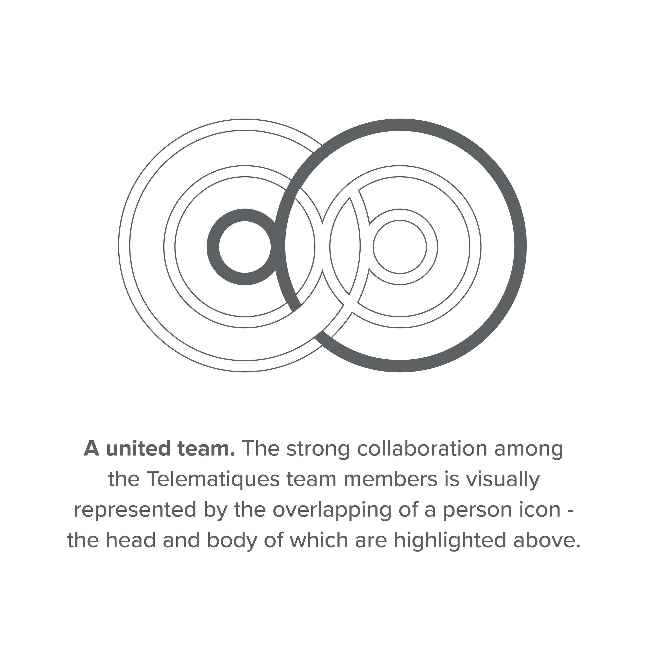
Outcome: The final logo highlights how cohesively the members of the Telematiques team work together through the overlapping of a simplified person icon (see top right visual). This overlapping results in the intersecting of concentric circles within two main spheres, which in addition to seamless team member collaboration, also speaks to the two main functions of the company (design and analysis) and how they intertwine. Moreover, we can see the idea of merging within the primary colour palette. This consists of the coming together of light and dark blues through the use of a gradient which further underscores the organization’s harmonious work culture.


